The making of SAHI Stride.
How our new brand mark came to life.
Unmistakable at a glance.
Works from favicon to billboard.
Signals sophistication, not mass market.
Built for screens, motion, and product.
Extends into intelligent product experiences.
Speaks the language of the market.
How our new brand mark came to life.
How our new brand mark came to life.
A new identity rarely begins with a logo. It begins with a conversation. A conversation about who you've become, where you're headed, and whether the way you present yourself still reflects the company you're building. Over the last few months, we asked ourselves those questions repeatedly. We explored countless ideas, challenged our own assumptions, discarded concepts we were attached to, and slowly shaped an identity that felt true to who SAHI is today. This is the story behind SAHI Stride.
When SAHI first launched, our goal was simple: make trading more accessible and intuitive. As the company evolved, so did our ambition. We weren't just building another trading platform anymore. We were building products, intelligence and experiences for traders who value clarity, precision and confidence in every decision they make.
Somewhere along that journey, we realised something important. The company had already evolved, but our identity hadn't. It no longer reflected the confidence of our product, the maturity of our thinking or the direction we were heading. Rebranding wasn't about creating a more modern logo or following a design trend. It was about building an identity that could grow with SAHI for years to come.
Before opening Figma or sketching our first concept, we stepped back and asked a much simpler question: What should never change?
The answer became our foundation. We wanted SAHI to feel calm in a space that often rewards noise, confident without being loud, and precise without becoming cold. Above all, we wanted every interaction to communicate intent, because trading isn't about making more moves - it's about making the right ones.
Stride isn't our new name. It's the idea that shaped our new identity.
A stride is deliberate. It reflects forward movement with intent, not remaining idle. That's a philosophy we believe extends far beyond design. Every meaningful trade begins with preparation, followed by clarity, conviction and finally action. That sequence - intent, decision and forward movement - became the thread that connected every part of this project.
Rather than designing a symbol around finance, markets or charts, we wanted to create an identity that represented the mindset of the people we build for. SAHI Stride is a reminder that progress is made one thoughtful decision at a time.
Like most design projects, the final outcome looks far simpler than the process behind it.
Over several weeks, our notebooks filled with sketches, our Figma files grew into hundreds of explorations and our walls became collections of possibilities. We explored symbols inspired by movement, direction, geometry, typography and abstraction. Some concepts felt too technical. Others leaned too heavily into finance. A few looked beautiful in isolation but disappeared once they were placed inside the product. Some were exciting for a presentation but lacked the longevity we were looking for.
Every rejected concept helped us understand what SAHI wasn't, which gradually made it clearer what it could become. Design is rarely about finding the right answer immediately. It's about eliminating every answer that doesn't feel inevitable.
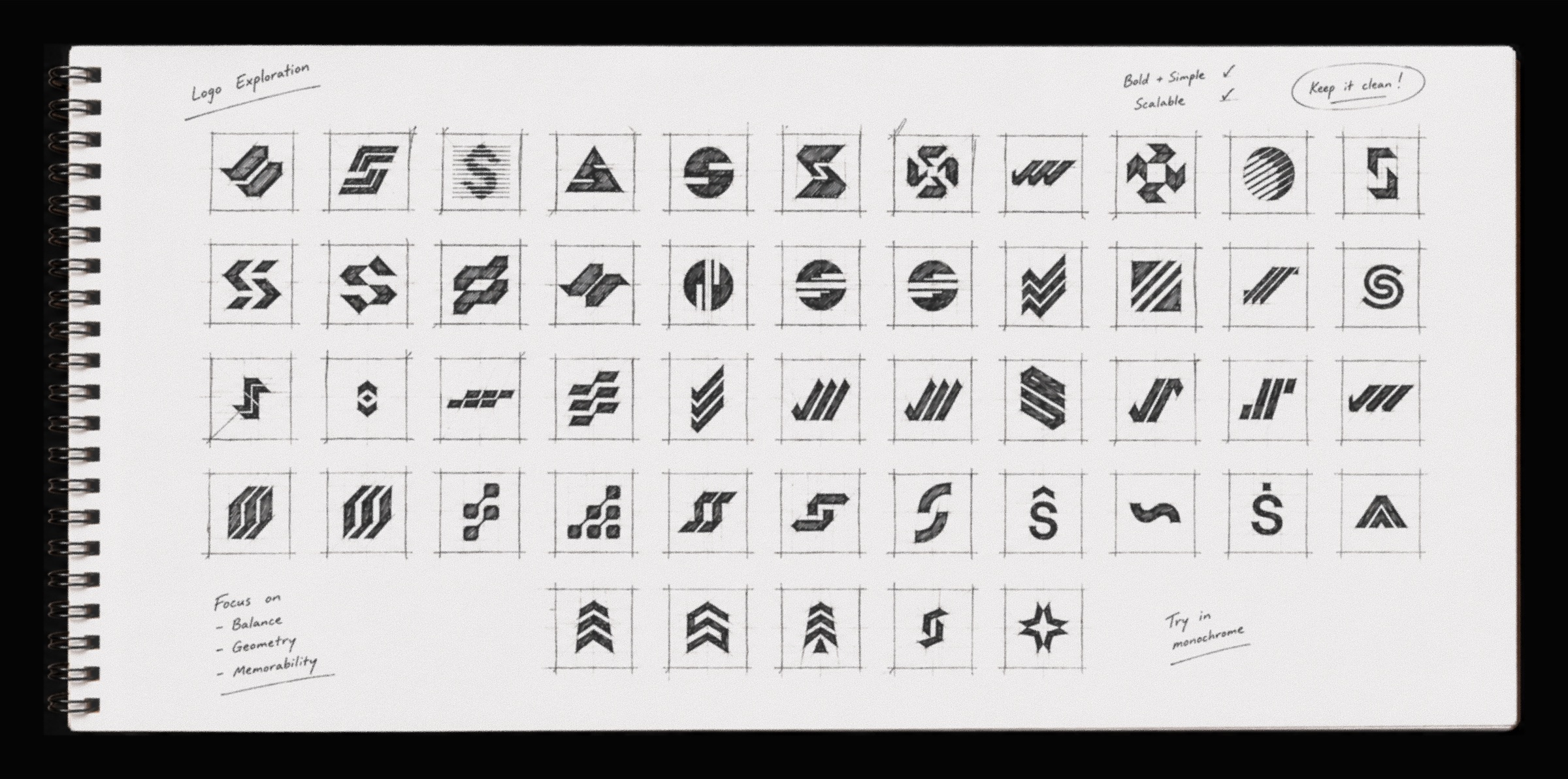
We never wanted the symbol to depend on hidden meanings or clever explanations. Instead, we focused on qualities that would stand the test of time. The mark needed to feel unmistakably simple, remain recognisable at the smallest sizes, animate naturally across digital experiences and sit comfortably everywhere from our product interface to our website and printed material.
The result is a symbol that feels quiet rather than loud. It suggests movement without relying on obvious visual metaphors, and confidence without unnecessary complexity. We believe the strongest identities don't ask to be understood - they become familiar through consistent use.
The new identity extends into every part of SAHI. From typography and colour to motion, iconography, layouts and photography, every element was designed to express the same principles of clarity, confidence and intent.
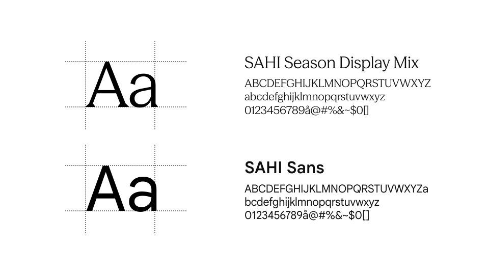
SAHI Season Display Mix is our display typeface. It gives the brand its voice in moments that matter, from headlines and campaigns to launches and hero experiences. It exists to create presence and make a lasting impression.
SAHI Sans powers the product. Designed for interface clarity, it is used across navigation, body copy, forms, data and buttons where information needs to be understood quickly and effortlessly.
Together, they create a system that feels expressive where it should inspire, and functional where it should perform, bringing consistency to every SAHI touchpoint.
Launching a new identity meant much more than introducing a new logo. It was about carrying the same thinking, clarity and craft into every place people experience SAHI.
The launch film became an extension of this thinking. Rather than explaining the logo, it tells the story behind the mindset that inspired it. Every frame, transition and movement was designed around a simple belief that has guided this project from the beginning: every move begins with intent.
Every identity captures a company at a moment in time. SAHI Stride reflects who we are today, but more importantly, it gives us a foundation for where we're headed next.
This isn't the end of a rebrand. It's the beginning of a unified brand and product experience. We'll keep sharing that journey here, because great design isn't just about the final outcome. It's about the thinking, craft and countless decisions that happen along the way.
Welcome to the new SAHI.
Download the official logo, brand assets, and brand guidelines. Everything you need to represent SAHI consistently.
A complete identity system designed to keep SAHI consistent across every touchpoint. From color and typography to brand applications, everything you need is included in one guide.
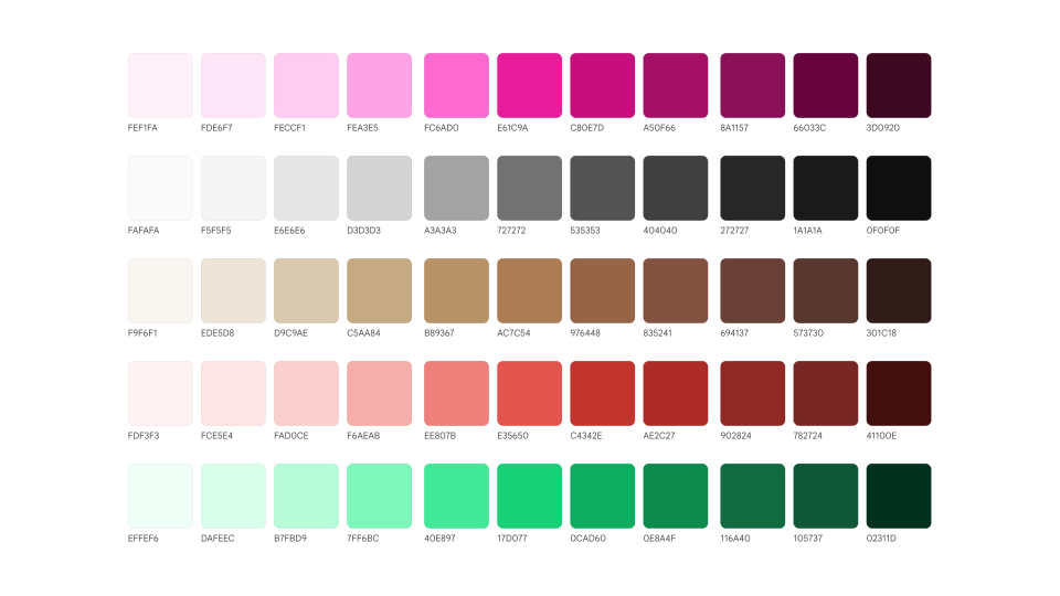
A carefully crafted palette designed for clarity, recognition, and consistency across product and brand experiences.
Season Mix brings personality to the brand, while SAHI Sans provides precision and readability across every interface.
A flexible system that scales consistently across products, teams, and future experiences without losing its character.

See how the identity adapts across digital products, marketing, social, presentations, and every brand touchpoint.
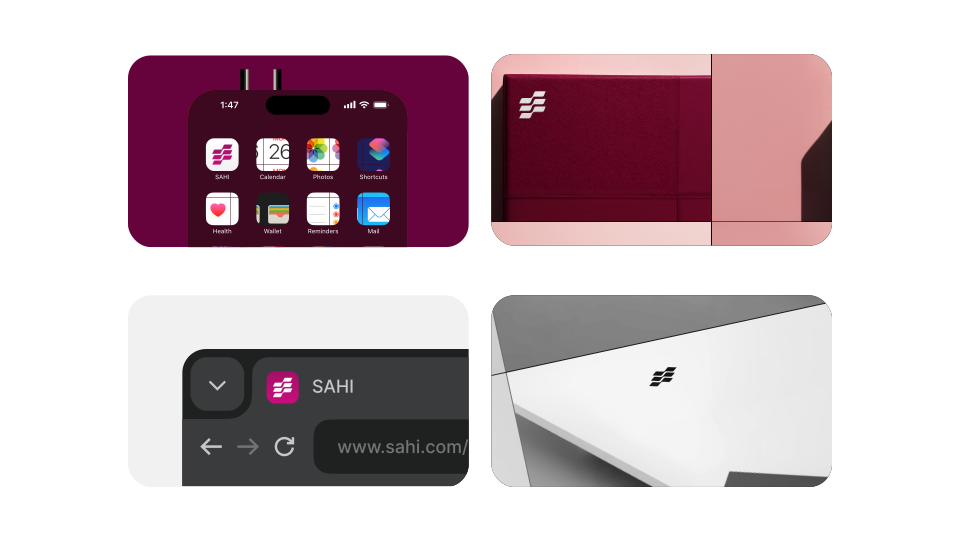
Official logos, brand assets, color tokens, and guidelines - organized and ready for designers, developers, partners, and media.
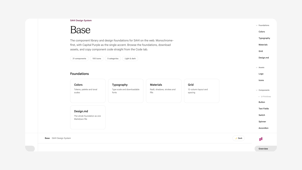
The complete SAHI Brand Guidelines, logo assets (SVG, PNG, PDF), color tokens, typography, icons, and supporting brand resources.
Yes, provided it's used in accordance with the brand guidelines. The assets are public to encourage consistent representation of the SAHI brand.
Yes. As the brand evolves, this page will always provide the latest version of the guidelines and assets.
Designers, developers, partners, media, creators, and anyone building with or talking about SAHI.
No. The logo should remain unchanged. Use the provided assets and follow the guidelines for sizing, spacing, and color.
Visit The Making of SAHI Stride in the Journal.
Our brand guidelines, logos, and assets are publicly available. If you can’t find what you’re looking for or have a partnership request, we’re here to help.